Hi everyone,
I'm Ellen, from the Community team here at Macmillan.
I'm posting here today to ask whether the members of this group would like to help us test a potential new group layout?
We know from user feedback that our groups could be structured better, to help members find the discussions and threads that are most relevant, and important to them.
As a team, we have designed a basic re-structure of how we think groups might be laid out better. We have run this structure through remote user testing, and the initial response to this has been positive, so we wanted to ask this group whether they'd like to try it out.
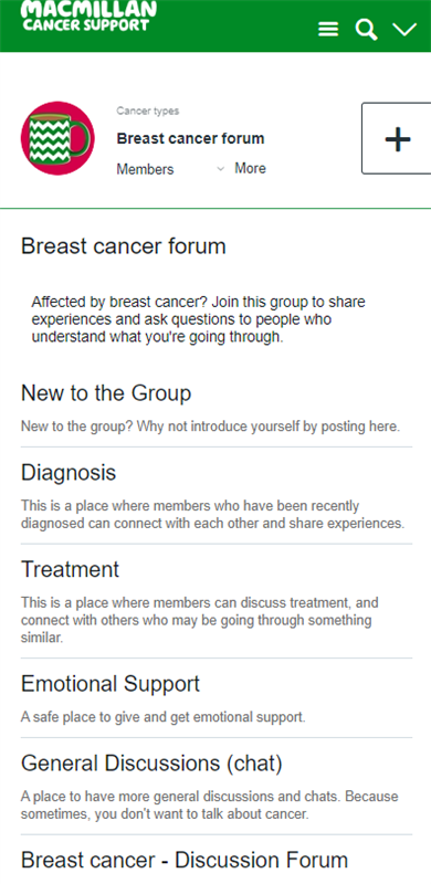
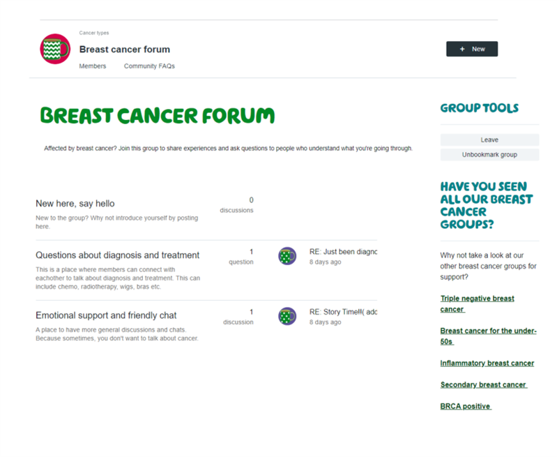
The suggested new layout would create spaces within the group to help categorise threads. We are suggesting having these sections:
And the group would look something like this:
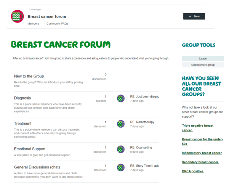
Users can then click into each of these sections, where threads that are related to that title would be shown.
We are absolutely open to your suggestions, and we want to create spaces that are most relevant for you, so we would like to hear your feedback on the suggested changes. I've included three very brief polls below, just to get some initial feedback from you.
If we see that this group is keen to try this, we will look to implement it early next week.
I hope you don't mind me answering your question from the letter to admin thread here, just as it's a very good question, and I wondered if it would be helpful for anyone else viewing this thread to see.
You asked: Hi Ellen, So how would this look, in ‘portrait form’ at the head of the page, on a mobile phone, say?
Good question! I've taken a snip from our test site of the suggested layout in a mobile view, it would look something like this:
We're open to suggestions though, as none of this is set in stone. We want members in this group to help us shape this, to ensure we're creating something that is helpful for you and our other groups too.
Best wishes,
Ellen
I think too many categories abs I think people confused where to post as if new here you will probably put your diagnosis there . My suggestions would be
If the other breast cancer forums could be linked here as they are really hard to find now it would be great.
Really like these suggestions, thanks Carol. I think you're right, too many categories. So with your suggestions, we could have three main categories so it would look more like this:
This is just a screenshot from our test site - what do you think? We would also likely have an 'Archive' section, where members can browse older content too.
Hi Londonmumof2,
We have a space on the side of the group where we've linked the other breast cancer forums, you can see them on the right hand side of the main page. We can have a think about how we can make this clearer though
Just in case it's helpful, you can also 'bookmark' these groups, so you can access them quickly and easily. There's some more information about how to use bookmarks in our help guides.
Hi Ellen,
I think the three main categories is a better idea than so many, otherwise people might not scroll.
Moomy
Thanks everyone, glad to hear you feel it works well.
We're also looking to have a 'Latest Activity' stream below these categories, which would pull through the latest activity from all of the areas within the group. So on the 'homepage' of the breast cancer group, we'd see these three categories, with an activity stream below so you can get an overview of all the conversations in the group.
This sounds good... if I'm thinking of it how you mean it.
I do think that many on here at the start of their journey types out there post 'about them' and want it to flow in a continuous thread, so all help, guidance, information given is in 'one place/one post'.
I feel it is only once you settle into the community that you start to respond and answer other posts - or if no one has really answered you question or you see someone else has posted a question similar - then you look at answer and reply (in a way that you are reaching out for help too).
So, I'm thinking the 'latest activity' maybe on the 'new here' thread would then show up each new person that has joined and the help they are looking for.....
My one concern is the and I'm not sure how this would work, we realise that virtually everyone new joining here is sadly looking for help either for themselves or a family member or friend. So the 'Questions about diagnosis' may lead peoples questions to get filtered away from their 'new here' post that gives them the chance to 'say hello and say what their worries are'. (if this makes sense).
I say this as another group I am a member of they have so many categories that it actually makes the site hard to use - I think like the others have said, less is more.
I also wonder, would it be a good idea to include the date of when the post was wrote in the opening category. At present we have the last person to of replied and the time they replied - but not date as to when the post was made...
(there is a 'heading' you can select posts to show by date, by title, by reply, etc. but not where does the 'actual date' show. I think this could be helpful.
Whatever cancer throws your way, we’re right there with you.
We’re here to provide physical, financial and emotional support.
© Macmillan Cancer Support 2025 © Macmillan Cancer Support, registered charity in England and Wales (261017), Scotland (SC039907) and the Isle of Man (604). Also operating in Northern Ireland. A company limited by guarantee, registered in England and Wales company number 2400969. Isle of Man company number 4694F. Registered office: 3rd Floor, Bronze Building, The Forge, 105 Sumner Street, London, SE1 9HZ. VAT no: 668265007