On Macmillan’s Community, our members are at the heart of everything we do. We’re always looking to improve the site for you and we’re so excited to finally be able to share some improvements that are just around the corner.
We know what an important source of support the Online Community is for many. In the next few weeks we will be launching a number of improvements on to the site. These enhancements aim to improve the site for all, as well as add a number of new features many of you asked for. All the images and examples below are shown using the Community on a mobile phone. We know these are the devices most used by our members.
The improvements we’ve made are based on your feedback. You spoke up and we heard you, now here’s what we’ve done.
Our New Homepage
You said that the site was difficult to navigate. You also said that the homepage was too cluttered and it took too much scrolling to get to the latest posts.
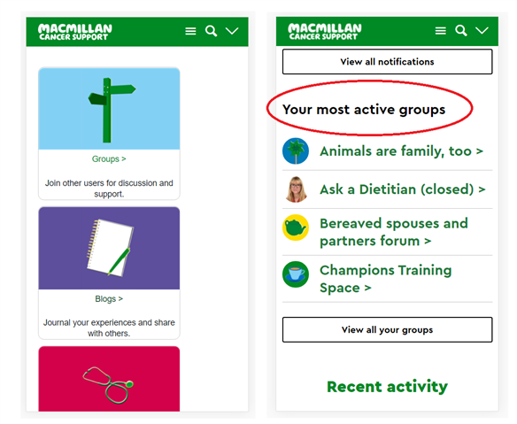
We have completely redesigned the homepage to make it more user friendly, especially on mobile.
We have also brought the news feed higher up the homepage. This means a lot less scrolling for our members, see just how much in the video below.
https://community.macmillan.org.uk/cfs-file/__key/communityserver-blogs-components-weblogfiles/00-00-03-89-19/7282.scroll1.mp4
Scroll one full page down and on the current site you still have a way to go to finding your personalised content. One page down with our improvements, you are straight to your most active groups. 
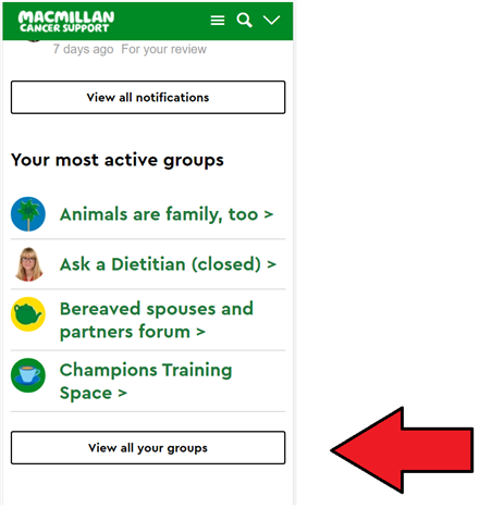
You said you didn’t like only having 4 groups on the homepage and that it was hard to find all your groups.
We added a ‘View all your groups’ button on the homepage. You can now easily find all your groups in one place.

Font Size
You said the font size was too small.
We have increased the font size across the whole site. Accessibility is very important to us at Macmillan. We want our Online Community to be available to anyone affected by cancer.
Send a ‘Virtual Hug’ with our new reactions.
You said you didn’t like the up-vote and down-vote buttons.
We know how warm a virtual hug can feel and we are so pleased and proud to introduce reactions.
https://community.macmillan.org.uk/cfs-file/__key/communityserver-blogs-components-weblogfiles/00-00-03-89-19/4213.reactions1.mp4
As seen in the media above, you can now interact with posts and content in a more intuitive way. You can react to threads, replies and even blog posts.
Hopefully the introduction of ‘reactions’ can help people affected by cancer to feel less alone, by allowing our members to share and connect in new ways on the site.
Latest Activity
You said it was difficult to see the newest post in a thread, also that knowing when a thread was started wasn’t easy.
We’ve added a number of features to make this easier on the site. Firstly, the most recent post in a thread will always be surrounded by a green box and have a black lightning bolt in the top left corner. You can also now clearly see the time and date of when a reply was sent. 
Making it easier to share your story
You gave us a lot of valuable feedback on our blogs section.
You said blogs were too difficult to create and that there were too many steps in the process.
Our new blogs page, is simple and better than ever. There will only be two steps to creating blogs from now on.
Press the button shown below.

and simply add your title and description.
You also said it was hard to find relevant blog content. We’ve created a new search function, to make that much easier. 
Simply type in the box the type of blogs you are looking for, the search function will show you the most relevant blogs.
We hope that you are happy with these coming improvements and that it’s clear how important to us member feedback is.
We’ll be bringing you more information about these improvements in the next few weeks, please keep an eye on our Community News Blog for all the latest updates.
We will always be here, continuing to develop the Online Community. We hope to forever be building an improving space that is kind and supportive, for people affected by cancer.
Have a question?
Why not comment down below and a member of the Community Team will get back to you.
To raise something more privately, we are always available at community@macmillan.org.uk too.
Whatever cancer throws your way, we’re right there with you.
We’re here to provide physical, financial and emotional support.
© Macmillan Cancer Support 2026 © Macmillan Cancer Support, registered charity in England and Wales (261017), Scotland (SC039907) and the Isle of Man (604). Also operating in Northern Ireland. A company limited by guarantee, registered in England and Wales company number 2400969. Isle of Man company number 4694F. Registered office: 3rd Floor, Bronze Building, The Forge, 105 Sumner Street, London, SE1 9HZ. VAT no: 668265007