On 29th July, we launched an upgrade of our Community site. The changes we have made are to ensure that the Community is working on a much more stable platform so that our users encounter less technical issues and that we can grow and develop the Community in a safe and well-supported way.
We are not where we had hoped to be since launching the upgrade. We are working through a list of bugs and issues which we did not expect to see and these are taking much longer to resolve than we had hoped.
We are grateful for all of the feedback we are receiving from our Community and we are listening. We have been escalating these issues and logging each and every one to ensure that we are capturing as much feedback as possible.
Survey Results
We recently launched a survey, asking our members for feedback about the new site. We had 853 responses to our questions and we wanted to share some of the results. We asked:
How do you feel about the look and feel of the new site?
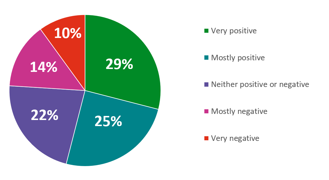
Overall, 54% of you responded positively to the new look and feel of the site, whilst 24% said they felt either negative, or very negative about the new site.
How well do you think the new site works?
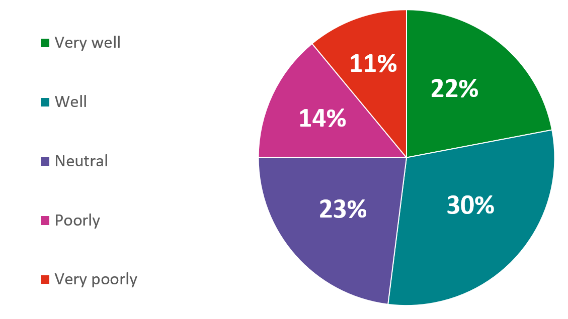
Overall, 52% of you said the new site works very well or well, whilst 25% said they think the new site works poorly or very poorly.
How easy do you find the new site to use?
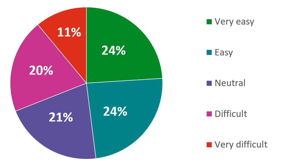
Overall, 48% of you said that you find the new site very easy or easy to use. 31% said that they find the new site difficult or very difficult to use.
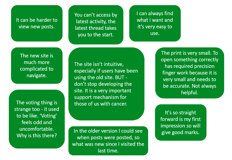
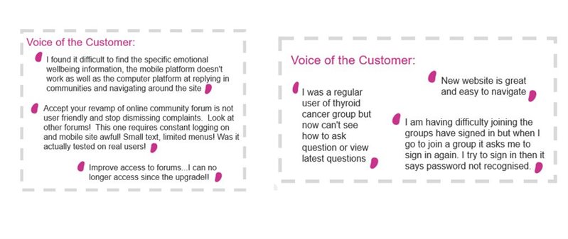
Within the survey, we also asked for you to share anything that you felt could make your experience of the Community better. You said:
Customer Satisfaction
Alongside running our feedback survey, you may also see a ‘pop up’ on the side of your screen when using the Community. This is a quick survey run by Macmillan to ask users how they are finding their experience. This pop up is present across the Community, as well as Macmillan’s main website.
The Community has experienced a decline in our Customer Satisfaction score. We believe this is strongly related to the new site upgrade.
Issues and bugs on the site
The Community team are capturing all feedback from the site, as well as feedback sent directly to us (community@macmillan.org.uk) and sent via our surveys.
We are working through a list of bugs and issues as fast as we can and below are updates on some of the bigger issues users are experiencing on the site.
‘Reply’ button working intermittently
Users being logged out frequently
Private Messages not working properly
The ‘Latest’ button taking users to the top of a thread, not the latest post

The above are a handful of the issues we are working through just now and we want to say a huge thank you for your patience. Whilst we aren’t always able to respond on the site, we are reaching out to anyone who has issues through email privately.
What happens next?
We are committed to getting this right for our users and we are working incredibly hard to ensure we get the resolutions we, and our users, want.
The new platform gives us much more stability, and we are grateful to hear all of your feedback. We are doing everything we can and we are really keen to continue to hear from you about how we can improve.
If you’re having any issues on the site, or you’d like to send some further feedback then please don’t hesitate to contact us on community@macmillan.org.uk.


